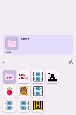
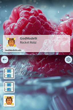
# Themes
Using themes, the look and feel of Pico Launcher can be customized. Themes are placed in subfolders of the `/_pico/themes` folder. For example `/_pico/themes/my_theme`.
## JSON file
Each theme has a `theme.json` file with information about the theme.
- **type** - Type of theme. Currently `material` and `custom` are supported. See below for information about each type.
- **name** - The name of the theme.
- **description** - Description of the theme.
- **author** - Author of the theme.
- **primaryColor** - Material Design 3 primary color to use. `r`, `g` and `b` are provided in range 0-255.
- **darkTheme** - When `true`, a dark Material Design 3 palette will be used.
### Example
```json
{
"type": "material",
"name": "Theme name",
"description": "Theme description here.",
"author": "Author Name",
"primaryColor": {
"r": 149,
"g": 143,
"b": 237
},
"darkTheme": true
}
```
## Material type
The `material` type theme is a pure Material Design 3 theme. It will be fully themed based on the `primaryColor` and `darkTheme` settings from the `theme.json`. In coverflow mode, this theme type uses a Material Design 3 style carousel.
## Custom type
The `custom` type theme is much more customizable, compared to the `material` type theme.
Note that the `primaryColor` and `darkTheme` settings from the `theme.json` are still used to color some parts of the UI.
The following additional files are needed:
| Files | Size | Format | Description |
|--------------------------------------------------------------|----------------------|--------------------------|----------------------------------------------------------------|
| bannerListCell.bin
bannerListCellPltt.bin | 256x49 (209x49 used) | A3I5
32 color palette | Unselected item background for banner list mode. |
| bannerListCellSelected.bin
bannerListCellSelectedPltt.bin | 256x49 (209x49 used) | A3I5
32 color palette | Selected item background for banner list mode. |
| bottombg.bin | 256x192 | 15 bpp bitmap | Bottom screen background. |
| gridcell.bin
gridcellPltt.bin | 64x48 (48x48 used) | A3I5
32 color palette | Unselected item background for grid modes. |
| gridcellSelected.bin
gridcellPlttSelected.bin | 64x48 (48x48 used) | A3I5
32 color palette | Selected item background for grid modes. |
| scrim.bin
scrimPltt.bin | 8x42 | A5I3
8 color palette | Background for the toolbar. Intended to be a translucent fade. |
| topbg.bin | 256x192 | 15 bpp bitmap | Top screen background. |
These files can be created, for example, using [NitroPaint](https://github.com/Garhoogin/NitroPaint).
The top screen background should include a box in which the banner text and icon of the selected item will be shown.
## Background music
All themes support background music by placing DSP-ADPCM encoded `.bcstm` files in a `bgm` folder inside the theme folder. Looping is supported. When multiple `.bcstm` files are provided, the background music will be selected at random each time Pico Launcher is started.